

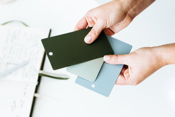











In interior design, knowing where to start is often the hardest part.
Even if you don’t stick to it strictly, sometimes having a rule to follow can help to narrow down your choices, giving you direction when the possibilities seem endless. That’s exactly what the 60-30-10 color rule offers. It’s a jumping off point: a way to help you define your color palette so that it feels balanced and layered.
What is the 60-30-10 color rule?
Just as photographers rely on the rule of thirds, interior designers use the 60-30-10 rule to give their color palette proportion in a space. The rule divides color choices in the room according to:
- 60% dominant color
- 30% secondary color
- 10% accent color
How does the 60-30-10 color rule apply?
Your dominant color accounts for around 60% of the room, so it’s usually the color you’re using for your walls, ceilings or floors – large surfaces that take up space.
The secondary color is used for around 30% of the room, which might mean large fixtures such as a bedhead, cupboard doors, rug or feature wallpaper.
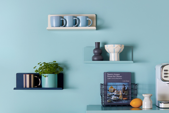
The accent color is your 10% so reserve it for small spotlights. Accent colors are a nice choice for soft furnishings like cushions, lamps or artworks, and because these are easy to switch out, you can update your accent color without too much trouble.

How to choose the dominant color in your space
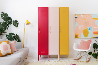
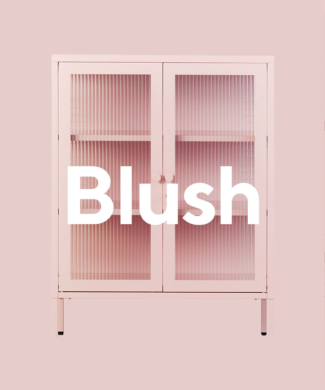
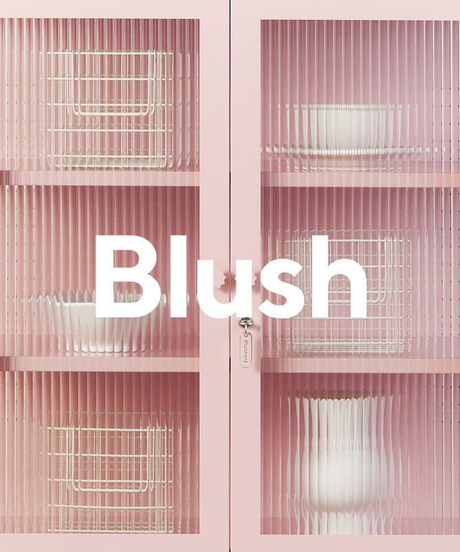
Often, the dominant color in the 60-30-10 rule will be a neutral. Neutral colors like cream, tan and gray won’t overpower a space, and they work back with lots of different secondary and accent colors. But color lovers, that’s not your only option. In this space, Blush works beautifully as the dominant color. It’s lighter than the secondary color, Poppy, which lets the pops of red shine, and the green accent color really stands out next to the pairing of pink and red. The overall result is harmonious, with the color scheme kept tightly edited, but it’s still packed with personality and fun.

How to apply the 60-30-10 rule to a white room
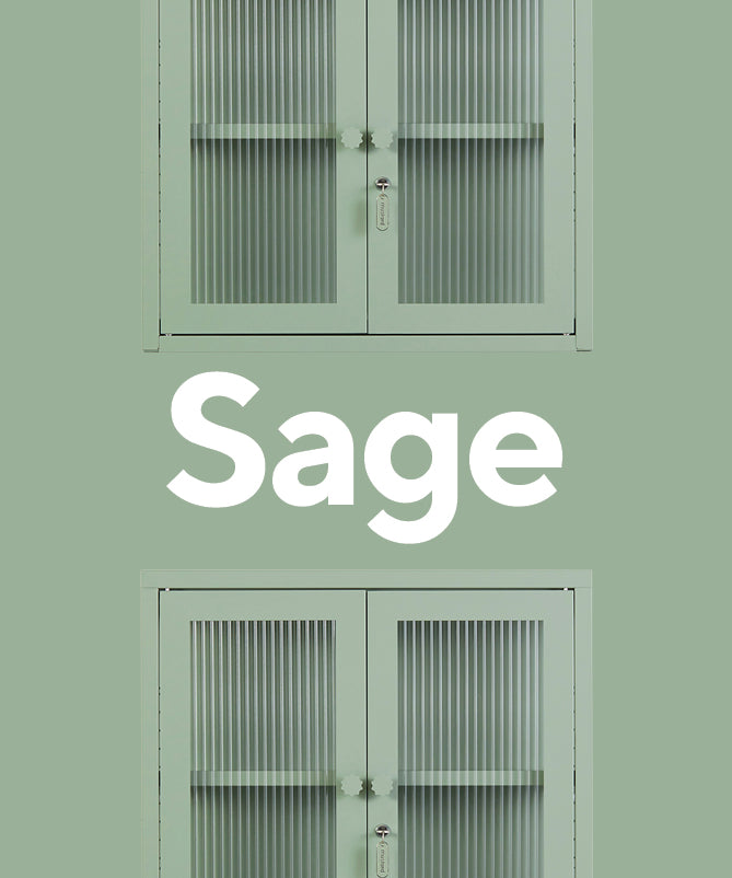
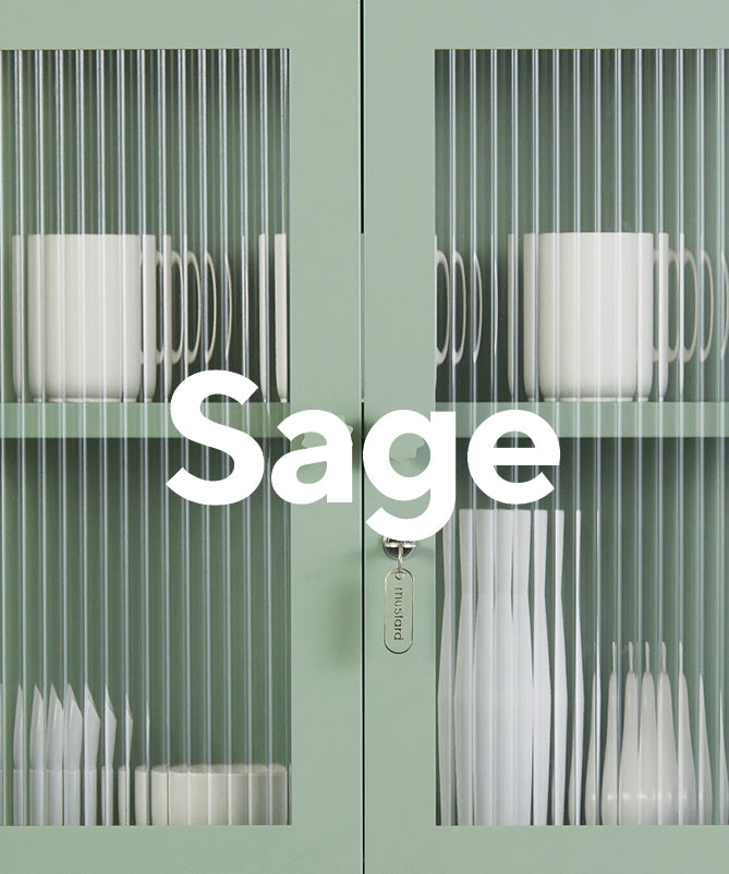
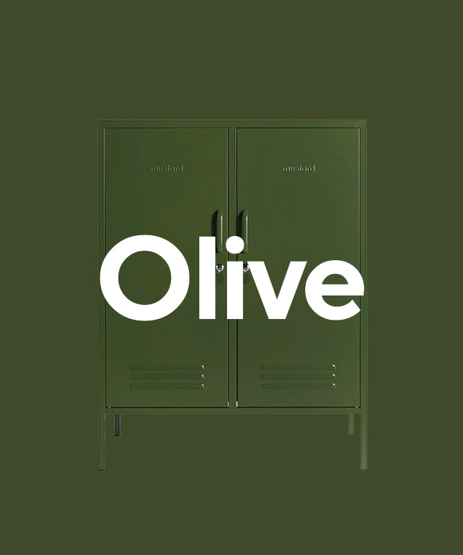
Whether it’s because you’re renting, or you prefer your walls a little more pared back, white walls can still work for the 60-30-10 rule. In this setup, the soft furnishings do the color scheme’s heavy lifting. With the bed being the focal point of the room, the Olive linen acts as the dominant color, while the Sage Shorty steps up as secondary and the pops of Blush in the lamp and artwork create the accent. This is a great way to experiment with color as it’s low-commitment. Swapping out the bed linen or artwork choice is all it takes to try out a new color palette.

How to use the 60-30-10 rule in a maximalist space
Not much of a rule follower? You might be surprised to see the 60-30-10 rule applied even in more maximalist spaces. This room adds in elements of pattern and texture to create depth and layers, which gives the impression of a more eclectic color scheme – but the 60-30-10 rule still underpins the palette. With the walls drenched in sunny Mustard as the dominant color, the Collector in Navy stands out as secondary color, with the chairs and rug echoing it in various shades of blue. Stripes of Poppy in the vase and lampshade act as accent color. This room is proof that the 60-30-10 rule doesn’t have to feel like a paint-by-numbers exercise.

How to apply the 60-30-10 rule to neutral colors
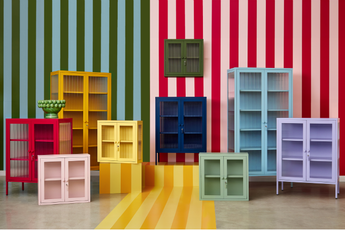
If you’re more into subtle colors and monochrome, the 60-30-10 rule can still help to create a sense of balance and proportion in your space. In this eclectic room, the large areas of Slate and Sage create a muted backdrop for the pops of electric blue to cut through. The result feels clean and effortless, without compromising on character.
It’s all about color confidence
Like all design rules, the 60-30-10 is just a framework. If you’re looking for inspiration, it can be a great place to start, but there are also plenty of beautiful spaces that don’t apply it. The beauty of color is that it is so personal. Our advice? Choose what speaks to you. You can’t go wrong with what you love.
If you’d like to explore more about color, take the Mustard color quiz to find your perfect palette.

















Leave a comment