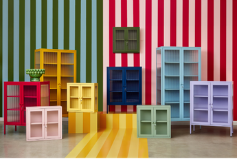
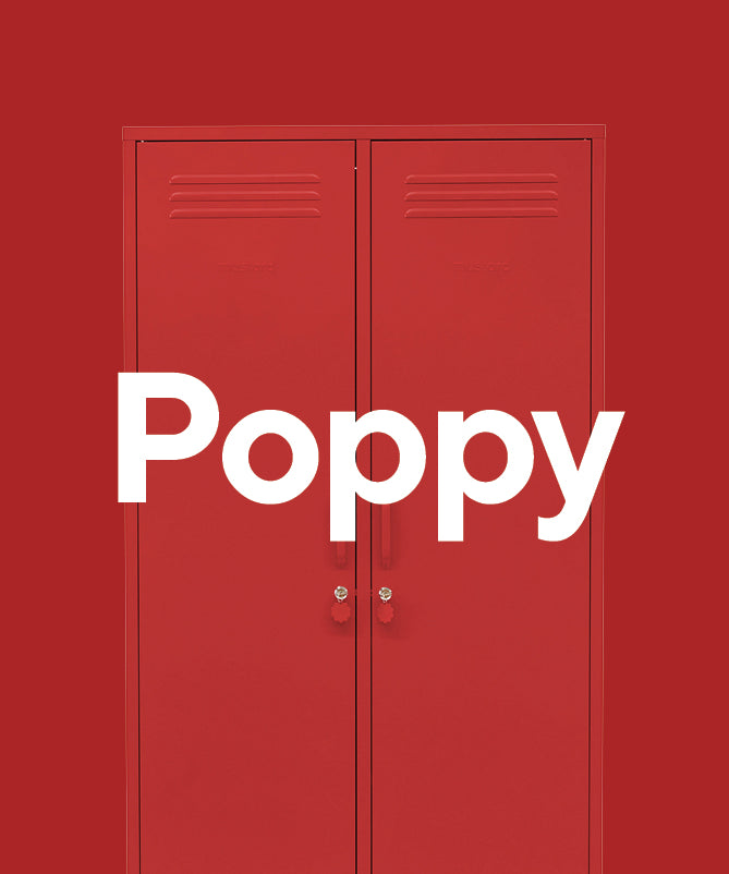
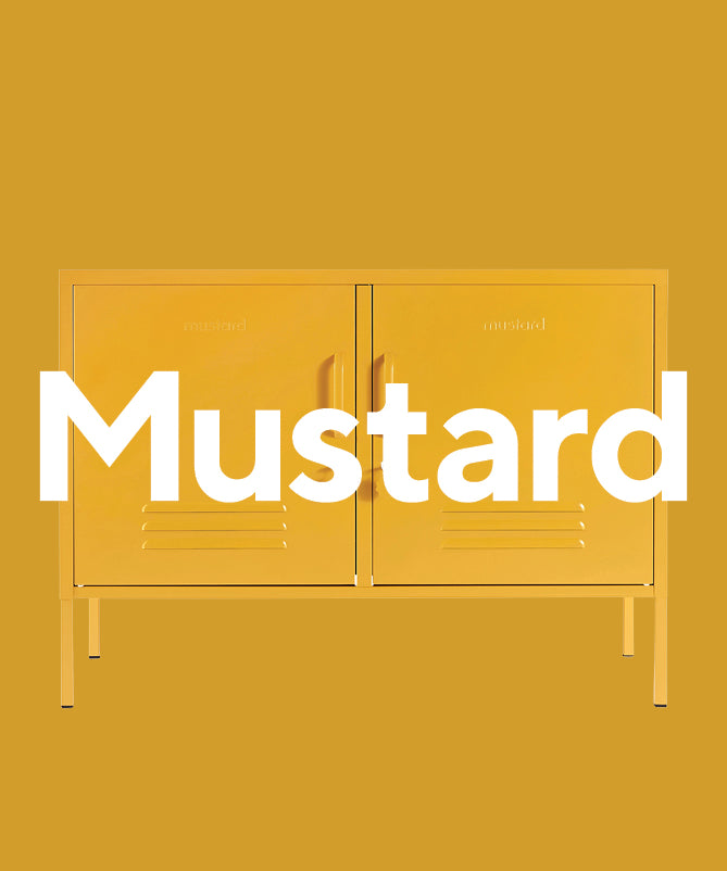
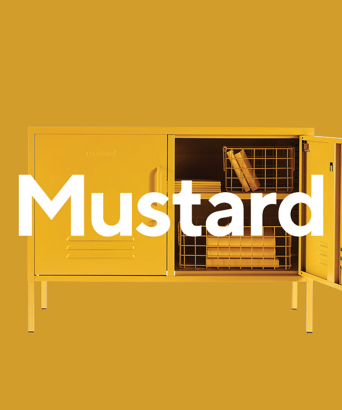
If neutral colors don't quite get your heart racing, maybe it's time to play with colors that pack a punch! Say hello to Poppy, Navy and Mustard (with a special guest appearance from Olive!)
They're bright, they're bold and they're full of personality. While primary colors are cute for kids, we love a grown-up take on them, styled with a Pop Art twist. With their retro-inspired shapes, lockers are right at home in the 1950s Pop Art era. And the Mustard rainbow would make Andy Warhol proud!
Styled as a standalone pop of color, or teamed up in a powerhouse color combo, here's how we make primary colors sing.
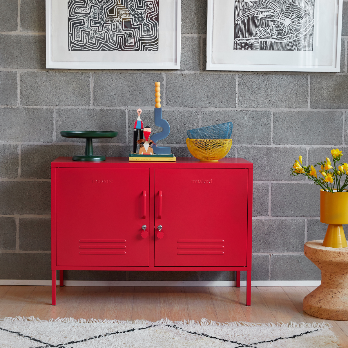
pop of color
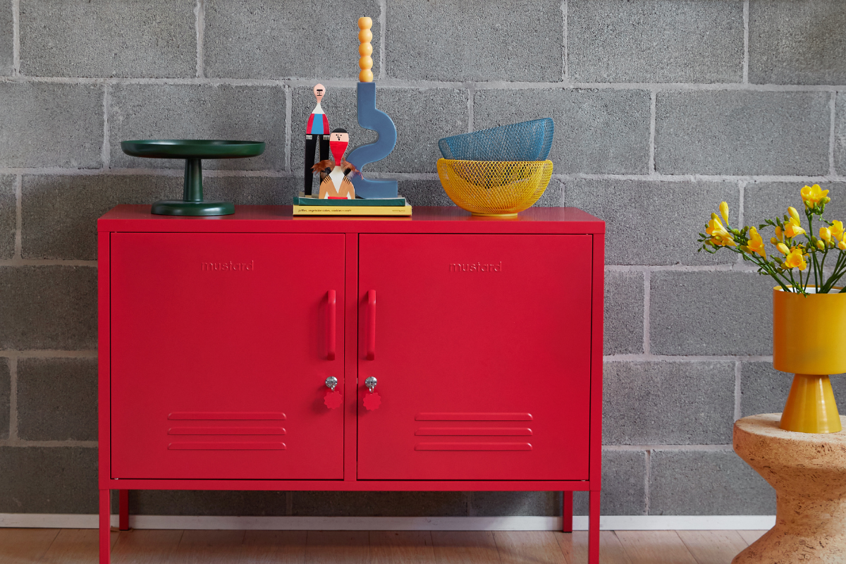
If you've got a muted space just crying out for some color, a solo locker in a primary color is the perfect way to brighten it! Choosing one feature color creates a powerful focus. This grey wall and monochrome artwork lets our Lowdown in Poppy shine. With small accent pieces in primary tones of blue and yellow thrown into the mix, this combination is bold and joyful.

two-tone tango
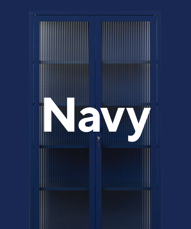
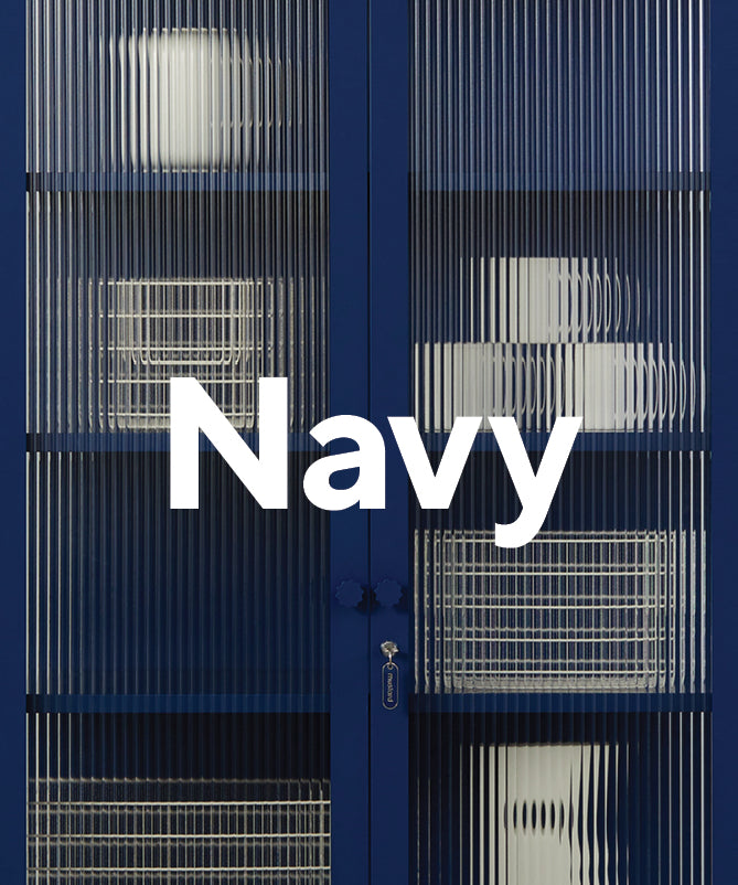
Want to take things up a notch? Mixing two primary colors will give your space a vibrant injection of color that still feels curated. The three primary tones — blue, red and yellow — are strong enough to hold their own, so you can't go wrong no matter which two you choose! We've gone with Poppy and Navy here for a rich, dramatic look, using an artwork to tie it together.

primary palette
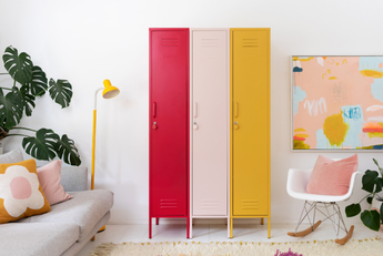
Feeling adventurous? There's an art to using a primary-coloured palette but done right, it totally pays off! Going for a base of white and neutrals gives the colors space to breathe, and opting for clean lines and solid surfaces rather than patterns ensure things don't become too busy. A trio of primary colored lockers in a white room lets the colors do the talking for a high-impact effect. Or go all out like Miio Store's Nina Battley (check out her home tour!) and layer in artwork and accessories for a bold palette that's totally cohesive.

honorable mention
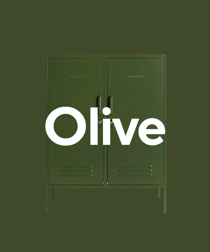
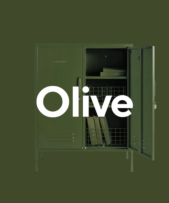
We know green isn't technically a primary color, but we love how Olive works with a primary palette! We give her an honorary place in our Pop Art lineup. After all, rules are made to be broken.
Leave a comment