


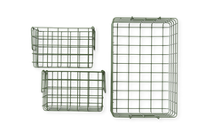

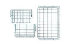
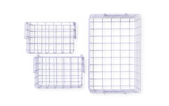

Welcome to the world of Mustard, where the hardest question is always 'which color do I choose?'
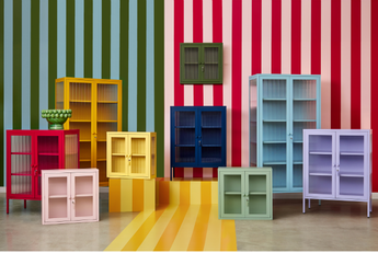
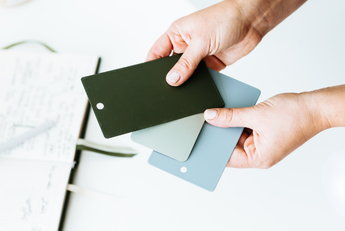
Whether you're looking for a mood-boosting color, a monochrome moment or a complementary color palette, there really are no wrong answers here. The beauty of the Mustard rainbow is that we've designed all twelve colors to fit cohesively together. They're a family, made to mix and match. If you're ready to find out which tones are cool and which are warm, discover their undertones and start playing favorites, let us introduce you to our rainbow.

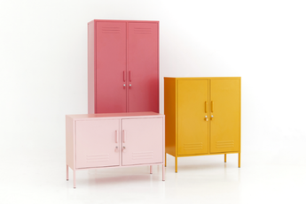
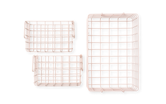
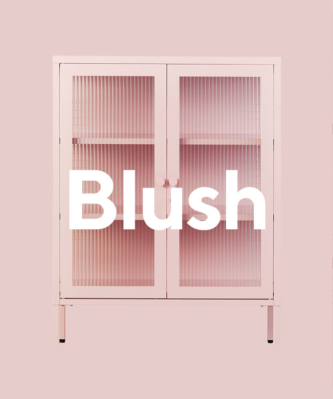
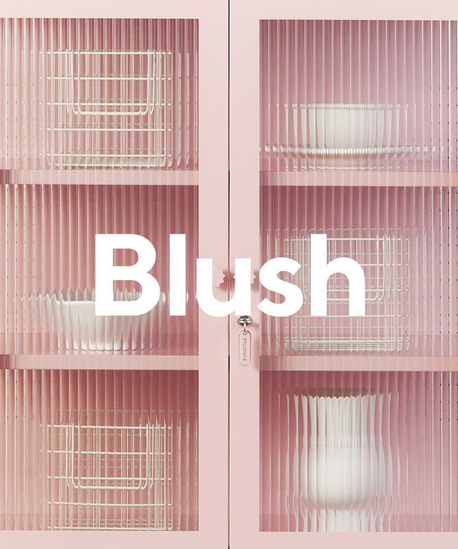
Blush
If you're looking for a not-quite-neutral, Blush is your perfect pink. With a cool undertone, she's a soft pastel that adds just the right pop of color.
Pairs well with: Berry and Poppy, or Mustard

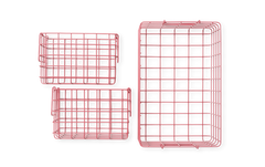
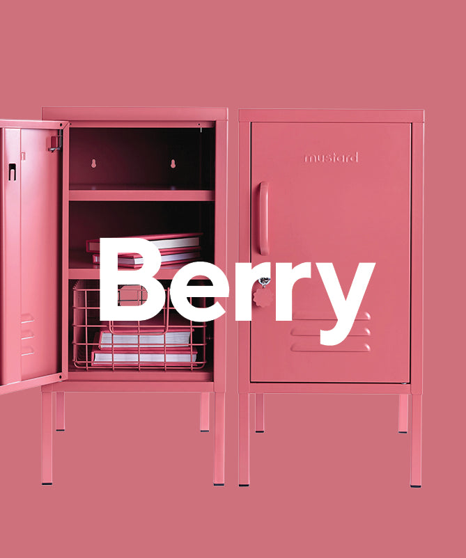
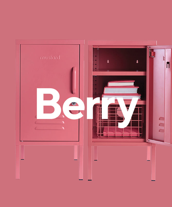
Berry
Inspired by summer fruit, Berry is our warm, bright pink for a bolder look. Not to be confused with hot pink, she's here to make a statement without coming on too strong.
Pairs well with: Olive or Lilac

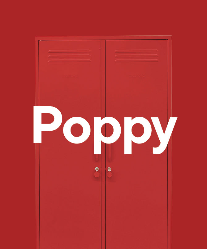
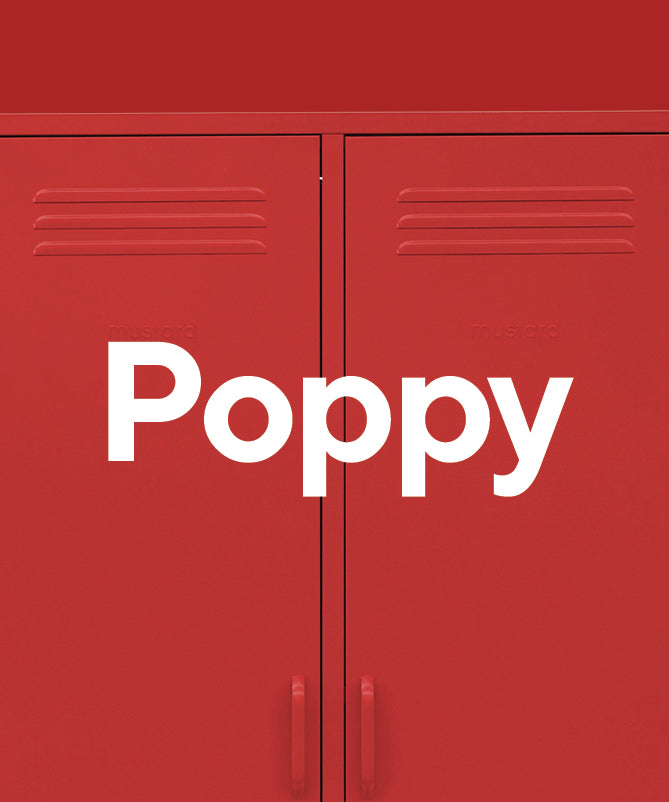
Poppy
Think London bus, letterbox, or the iconic telephone booth – Poppy brings the main character energy. This retro red is saturated, rich, and the cherry on top of any space.
Pairs well with: Lilac or Ocean

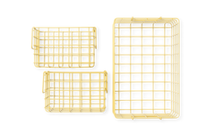
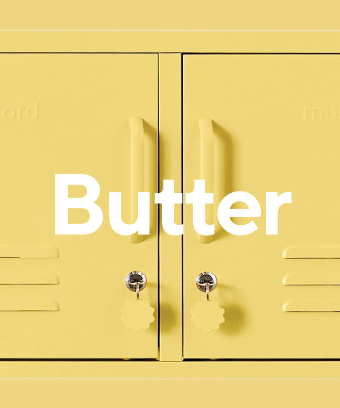
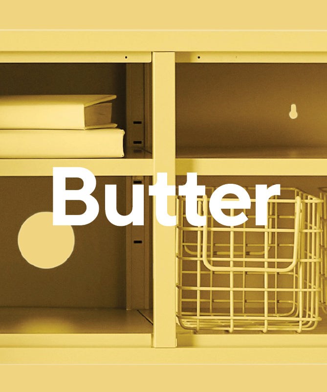
Butter
She's not lemon and she's not beige. Butter is our creamy, mellow yellow with a decadent depth. Like a trip to the south of France, she's here to bring the sunshine.
Pairs well with: Poppy or Navy

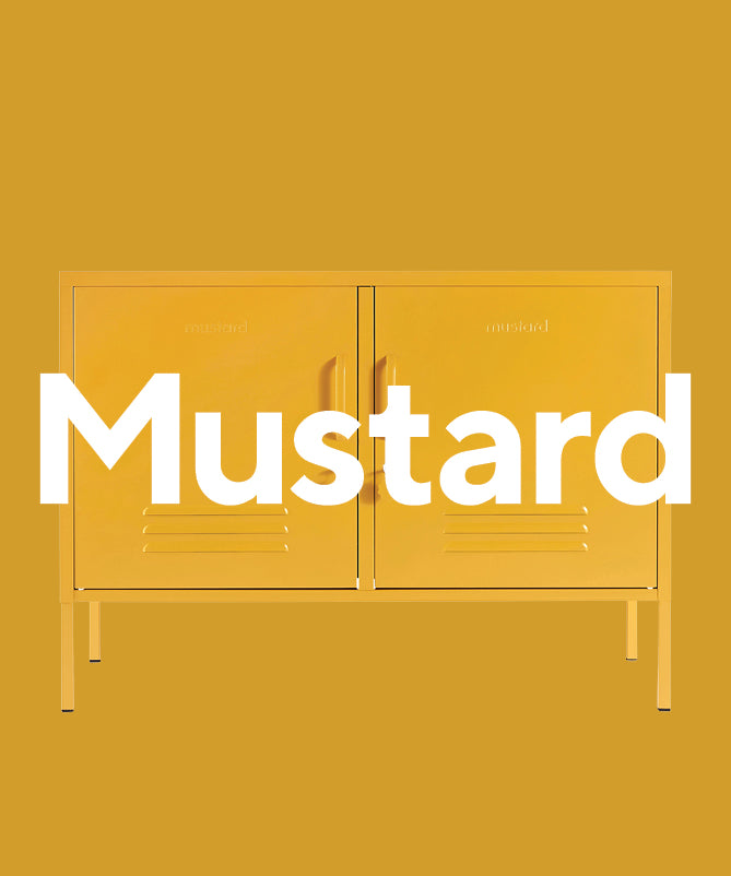
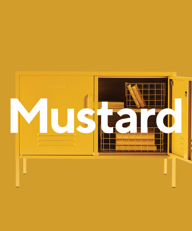
Mustard
Our namesake Mustard is a deep, 70s-inspired shade with a golden, turmeric glow. A dark and dusky yellow, she has a bit of a bite – just like the condiment!
Pairs well with: Lilac or Butter

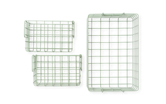
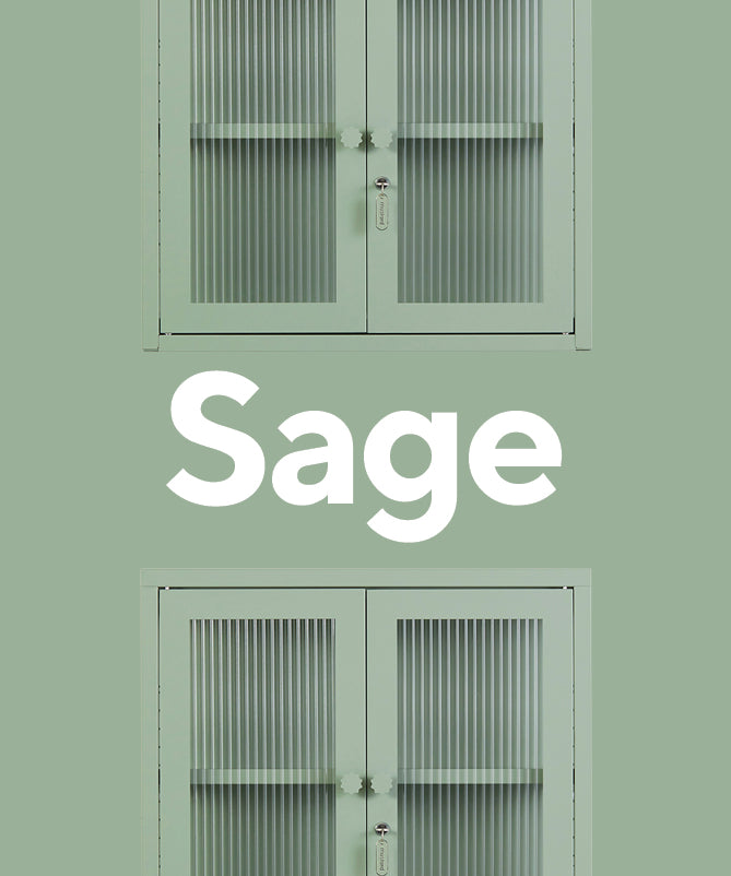
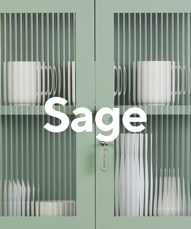
Sage
Soft and earthy, our bestselling pastel green is a color chameleon. A subtle gray undertone means she's less mint, more eucalyptus, and an all-time favorite.
Pairs well with: Blush or Olive

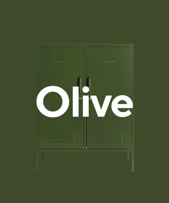
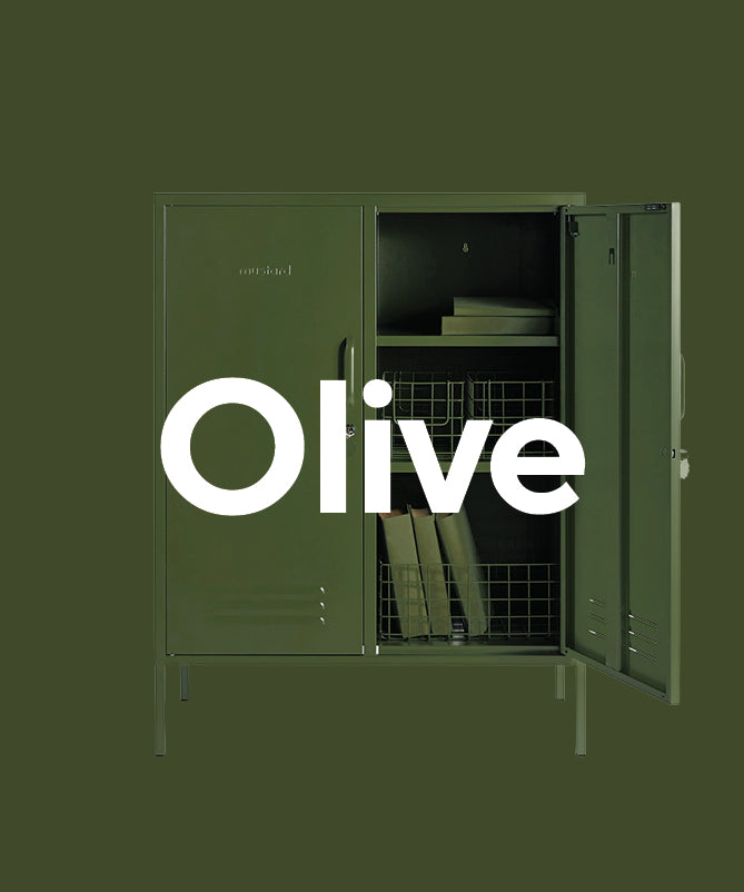
Olive
Our dark, moody green brings depth and character to any space. Richer than khaki, warmer than forest green, she's earthy and grounding and will outlast trends.
Pairs well with: Ocean or Sage

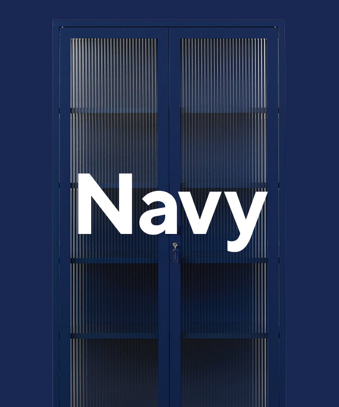
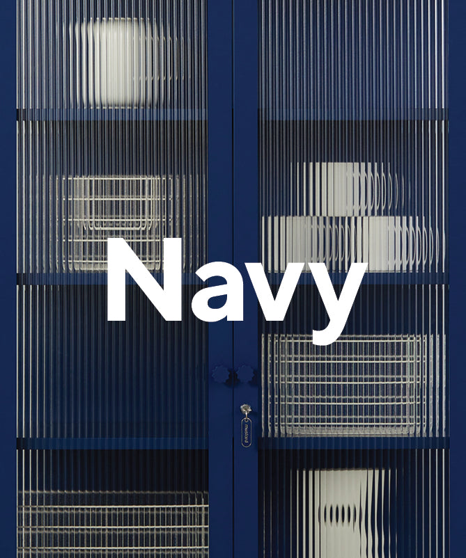
Navy
Brighter than midnight but darker than royal blue, our Navy sits somewhere in between! Think Yves Klein blue – she knows just how to catch the light for a punchy, blue pop.
Pairs well with: Butter or Ocean

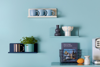
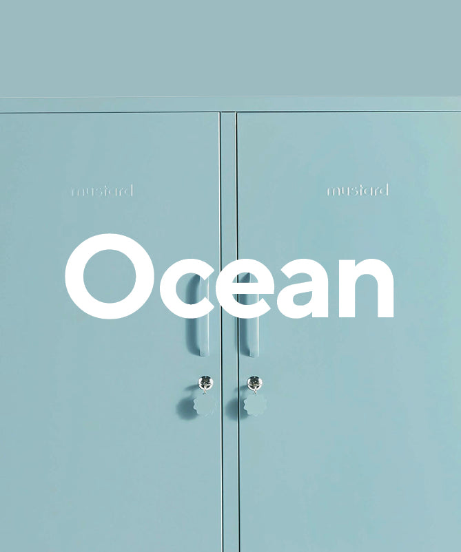
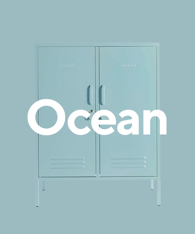
Ocean
Like the ocean on a cloudy day, our pastel blue is a little gray and stormy, giving her a moody edge that takes her from sweet baby blue to bold and beautiful.
Pairs well with: Sage or Pastels

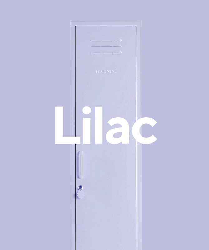
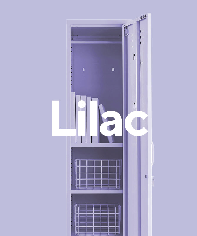
Lilac
Our dusky, powdery pastel purple is a cool-toned beauty. Leaning more gray than lavender, she brings a sophisticated palette and a punchy pop of color.
Pairs well with: Navy or Olive

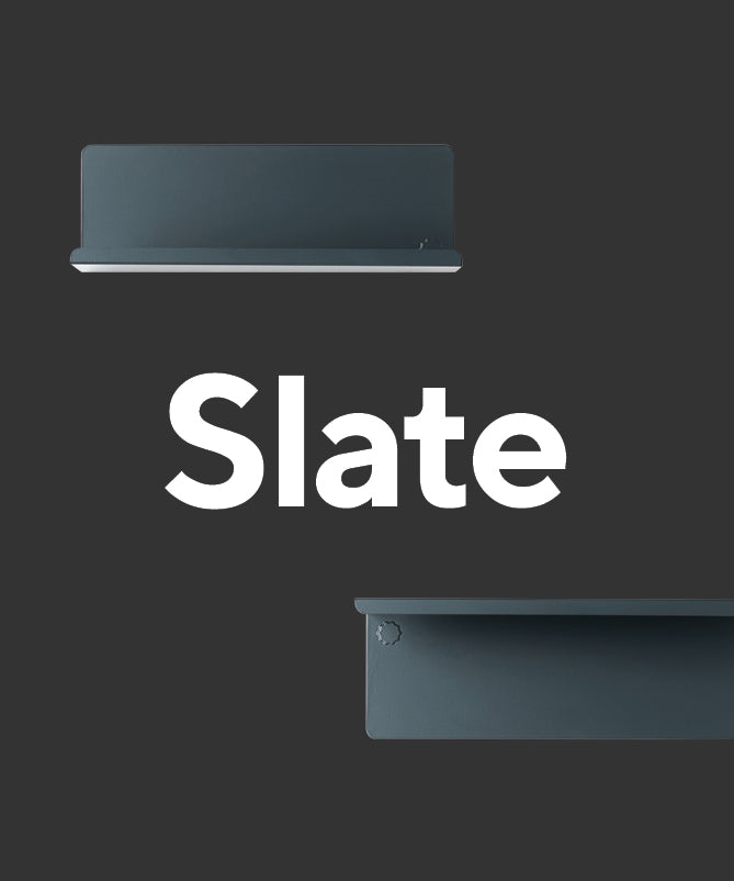
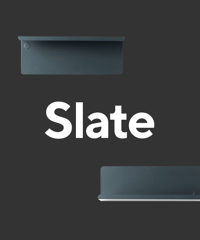
Slate
Nope, she's not black. Slate is our blue-hued dark gray, a deep charcoal with a refined, elevated look. A neutral with real dimension, she'll bring the mood.
Pairs well with: Blush or Chalk

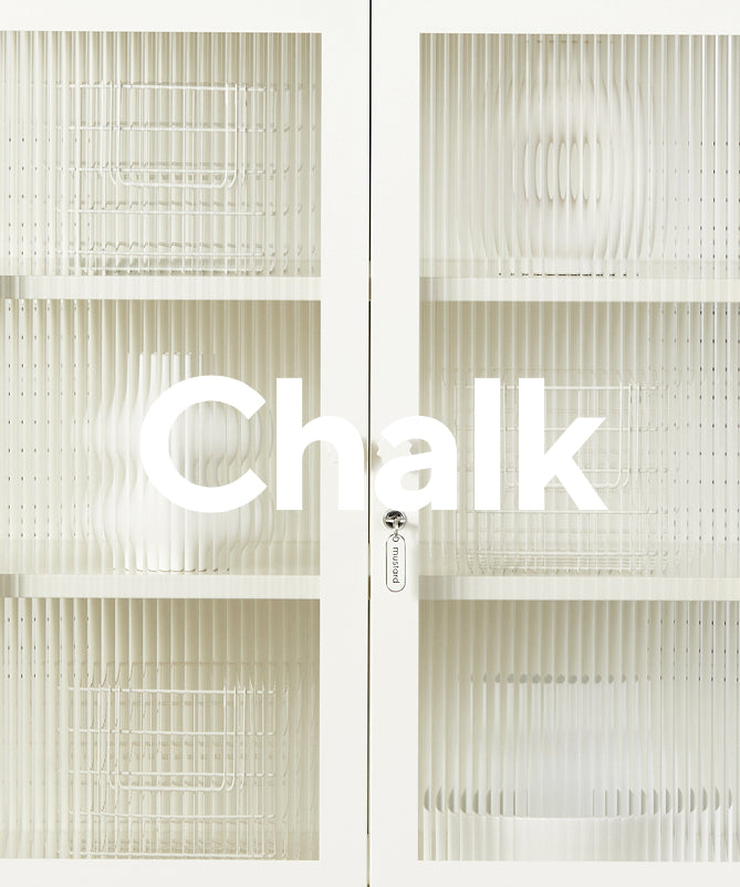
Chalk
Creamy, warm and bright, Chalk is our natural, inviting white. If you need a boost of light and air, a pop of Chalk is like opening a window.
Pairs well with: Every color of the Mustard rainbow!
Ready to see how your favorite color will look in your space? Check out our home tours for major inspiration.

Leave a comment